Non-profitMountain Association
Equity in Action and Vision
What We Delivered
Honoring the Path
Mountain Association, formerly MACED, has built a legacy of mindful inclusion as they work to build a strong and sustainable Eastern Kentucky. For more than forty years, the organization has invested in people and places in the region to advance a just transition to a new economy that is more diverse, sustainable, equitable and resilient.
The Problem
New Terrain
Forty years brings a depth of experience that results in sustainable, impactful programs and services. It can also bring a new vision and new strategies that are no longer reflected in the look, feel, perception or even name of an organization.
The Inspiration
Continued Progress
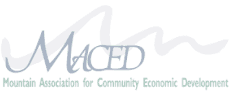
The Mountain Association is bold and innovative. Script fonts and tranquil, landscape-inspired colors did not match their spirit. Mt. Association deserved a visual identity that matched their progressive approach.
We shifted the Mountain Association from using a house of brands approach, meaning many independent brands living within the organization, to a brand house architecture.


Strategy & Tactics
Preserving Individuality, Maintaining Pace
The power of Mt. Association is their deep love of the Appalachia and the thoughtful collaboration with their communities and business partners. The logo mark subtly incorporates the initials M.A. into the mountain symbol as a nod to this passion as a hidden gem.
The new mark would need to be simple enough to allow for some color variance, representing each program. Bold colors representing each program needed a solid foundation, so the overarching brand mark is set in black. For typography, it was important to find a font that represented both the boldness and rural heart of the organization.
The expanded color palette provided a level of autonomy that programs desired while keeping a consistent visual mark that builds brand awareness at every turn.
On the development side of the process, we switched to the WordPress/Gutenberg block system and created custom blocks and customized the default blocks. Using blocks gives organizations the right mix of flexibility and brand consistency.
“P&P was able to look at us from an outside perspective and highlight the gaps in our communications strategy that we weren’t quite able to see. We’ll now be able to move forward with a solid foundation upon which to build.”
Betsy Whaley
Executive Vice President, Mountain Association
We delivered
- Brand Development
- Logo & Identity
- Brand Style Guides
- Business Cards
- Stationery
- Print Design
- Strategy & Research
- Research & Discovery
- Content Strategy
- Communications Strategy
- Naming
- Web Design & Development
- Website Design
- UI/UX Design
- Front-end Website Development
- WordPress Development
- Content Strategy & Copywriting
- Positioning Statement
- Brand Promise
- Storytelling
- Key Messages
- Personality & Tone
- Audience Insights
- SEO
- Communication & Design
- Brochure
- Social Media Assets
- Annual Reports
- Tradeshow Display
- Creative Partnership
- Strategy Consultation
- Internal Communications
- Audit

