HealthcareSterling Health Care
Extraordinary Care for All People
What We Delivered
A Bigger Vision
After eight years of serving Mt. Sterling and surrounding communities, Sterling Health Care was ready to level up. Their community health model is revolutionary, and they needed to look the part.
The Problem
Growing Pains
Sterling Health Care grew fast. When that happens, it can be hard to enforce brand standards. Their website was not responsive. Their digital presence needed work. Their print materials weren’t consistent. Leadership knew they’d only continue to grow. That’s when the CEO called P&P.
The Inspiration
Clear as Mud
Health care has been complicated for too long. Sterling Health Care believes it doesn’t have to be. They integrate mental and physical health and ease the personal health barriers their patients experience, like transportation and food insecurity. This is worked into every product of our partnership.


We Delivered
- Brand Development
- Logo & Identity
- Brand Style Guides
- Business Cards
- Stationery
- Print Design
- Strategy & Research
- Research & Discovery
- Content Strategy
- Communications Strategy
- Web Design & Development
- Website Design
- UI/UX Design
- Front-end Website Development
- WordPress Development
- Content Strategy & Copywriting
- Positioning Statement
- Brand Promise
- Storytelling
- Key Messages
- Personality & Tone
- Audience Insights
- SEO
- Communication & Design
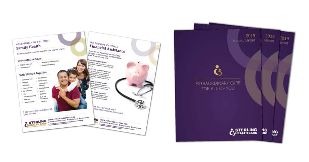
- Brochure
- Social Media Assets
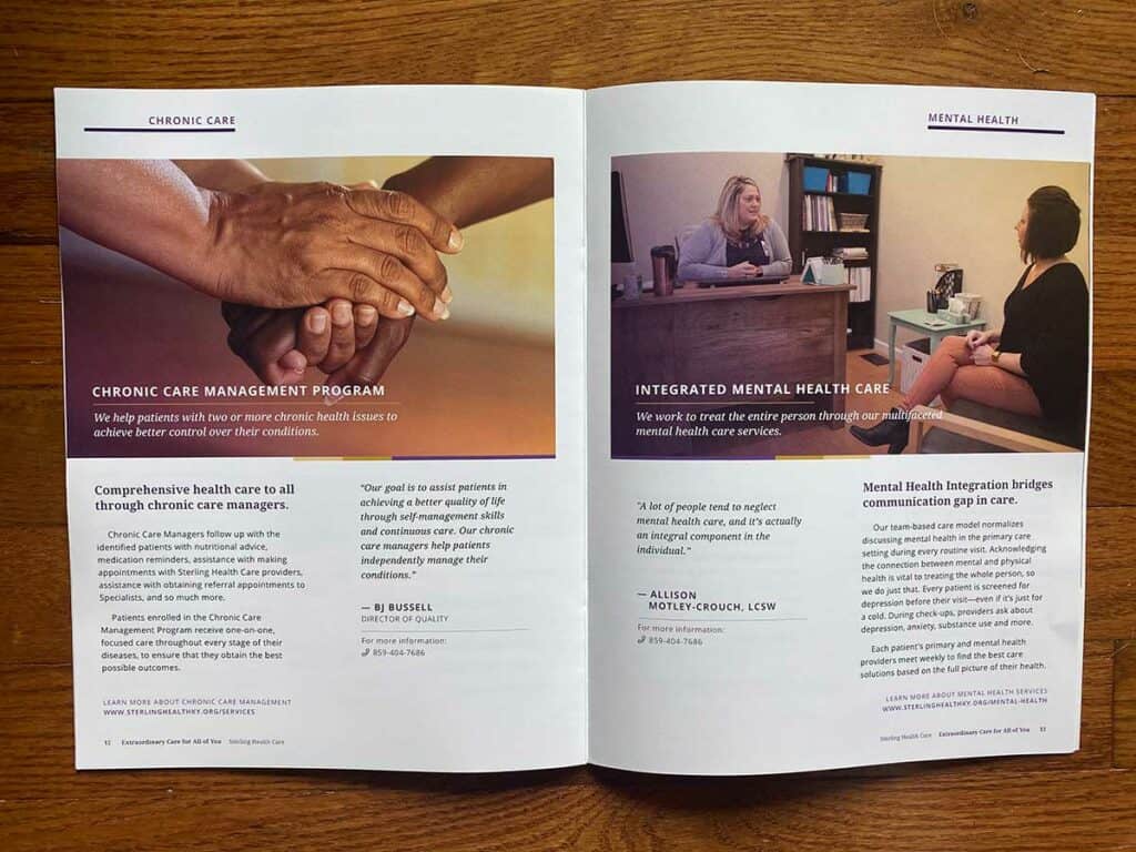
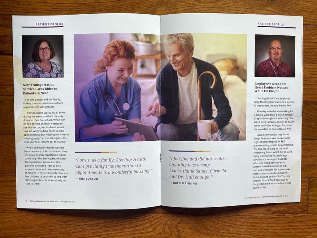
- Annual Reports
- Media Kits
- Creative Partnership
- Annual Planning
- Strategy Consultation
- Audit
Strategy & Tactics
Refining and Streamlining
The logo has an established presence across the gateway region, so reinventing the wheel wasn’t necessary this time. They needed to clean up other areas. The school-based health centers used cluttered combination marks with their tagline and school logos. Their clinic listings weren’t consistent on Google. Their social media presence had no unifying look or voice.
We got to work.
P&P unified the logo library. The expanded, more muted color palette immediately establishes a friendly, accessible brand presence. Then, we streamlined their digital persona so it reflected their reputation.
As for the website, we created a custom library of all providers and locations that is searchable and easy to navigate. We switched to the WordPress/Gutenberg block system, where we created custom blocks and customized the default blocks. Blocks give organizations the right mix of flexibility and brand consistency, and are easy to update.
Audience & voice
Keep it Simple
Sterling Health Care serves two groups of clients: The first group is people who are unemployed or underemployed. These folks often face significant barriers to receiving healthcare. The second group is people who are employed but are seeking a better healthcare experience. They represent all ages, races and gender identities.
As part of their patient-centered care model, Sterling Health Care sought to make their work more accessible to everyone. That meant losing the jargon. P&P created a direct voice that speaks clearly and consistently about the care they provide. We carried this voice through the website, print materials and social media. However patients reach out, they’ll quickly understand how to get the care they need.
social media
Consistency Equals Results
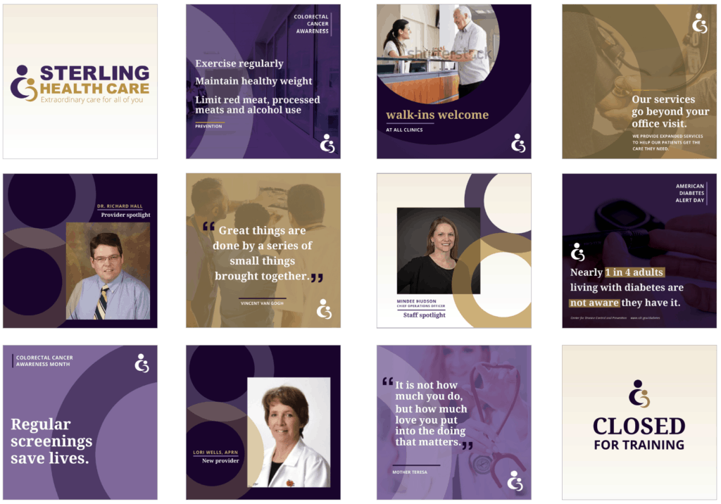
With close to a blank slate on social media, P&P worked with Sterling Health Care to establish a full year of content. For them, content looked like health PSAs every month, office event coverage, COVID-19 information and other important news items.
In only one year working with P&P, they gained almost 500 new followers, which was 25% more than they had before. But the biggest win was that engagement grew over 12,000 percent. Consistency helps engagement. Engagement helps visibility. Visibility means results.

